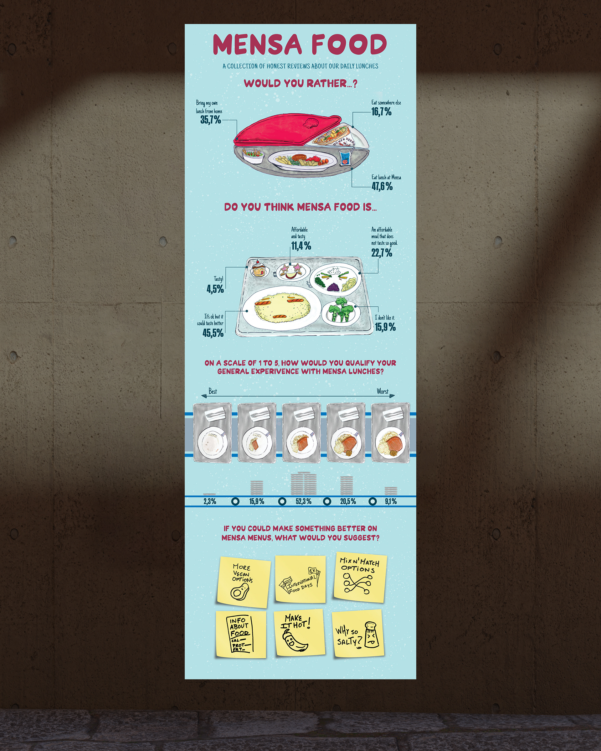
Data Visualization but make it sexy
This project took place in a one-week seminar about Data Visualization and how to make it interesting by creating appealing graphics related to the data gathered.
My research was based on Mensa, a canteen service that every University in Germany has, where students can buy very affordable meals, but sometimes the menu has very limited options or does not taste so good.
I sent an online survey to students and university staff, and with the data gathered I created different illustrations that are related to the visual elements of the canteen, and other food visual elements.
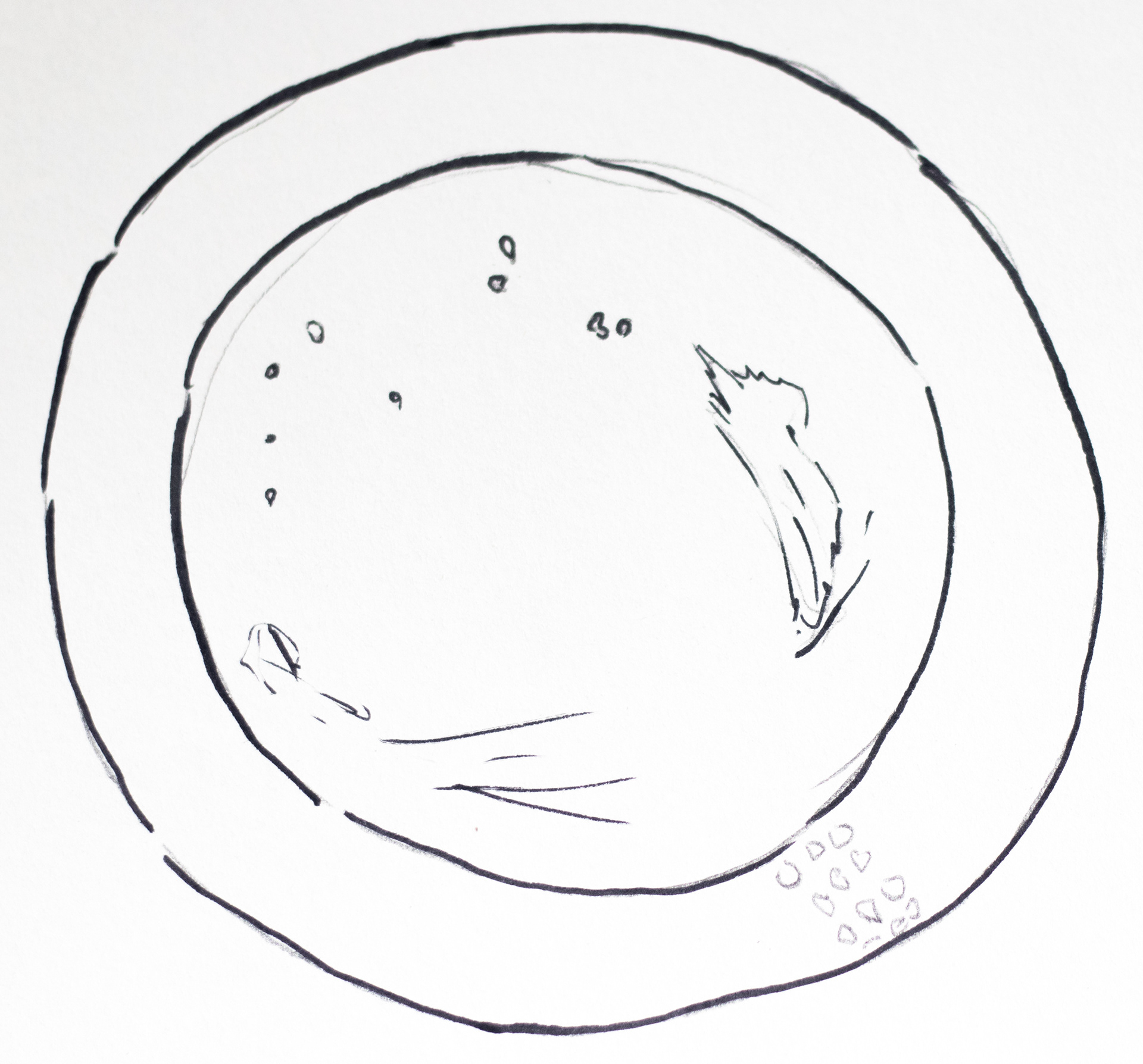
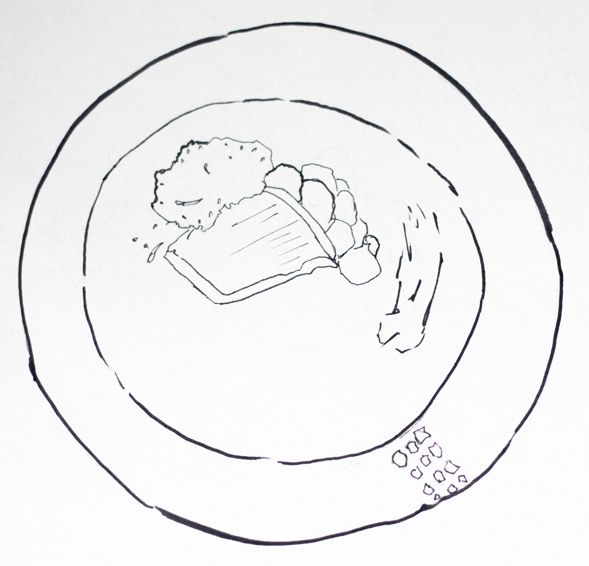
A total of 44 people answered the survey, and after that I started doing hand drawn illustrations that would later be digitally painted.
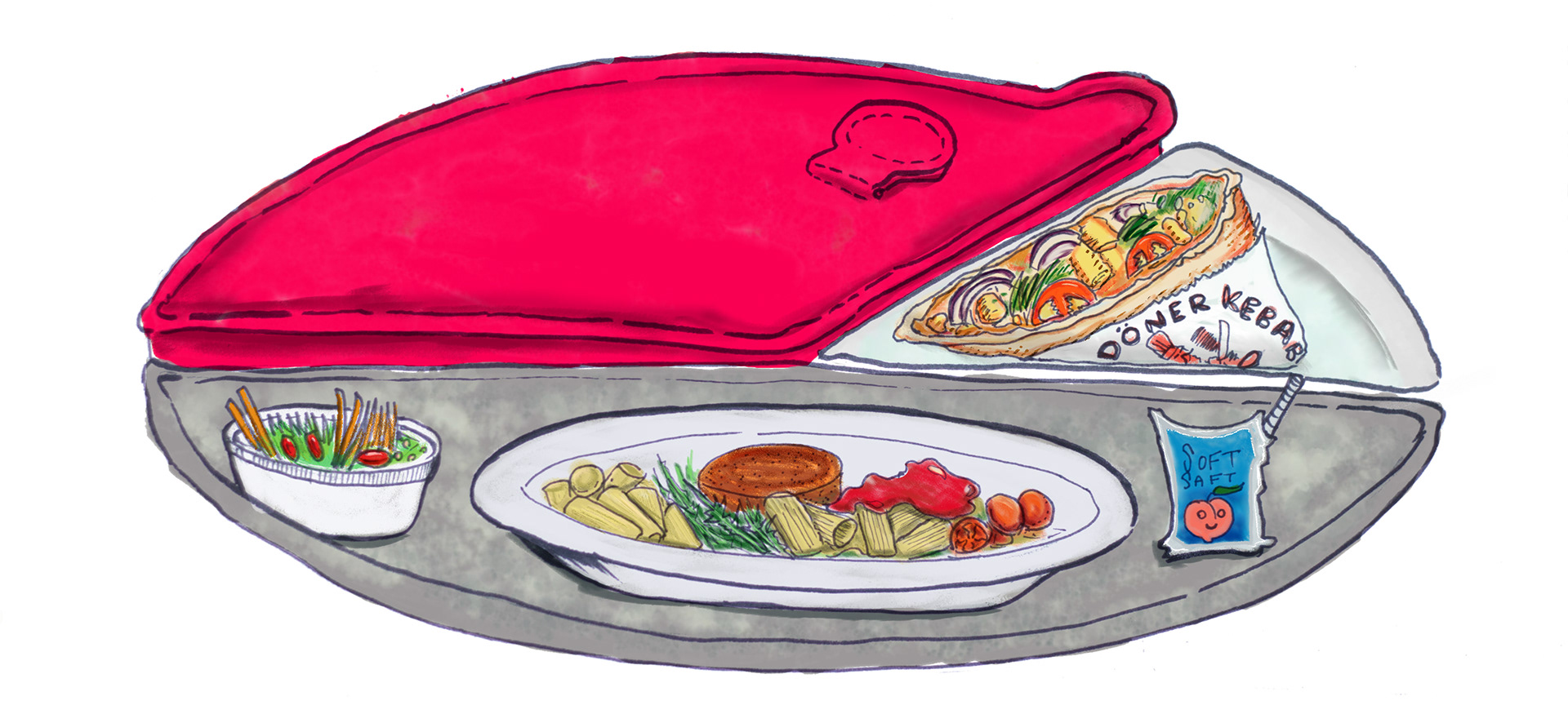
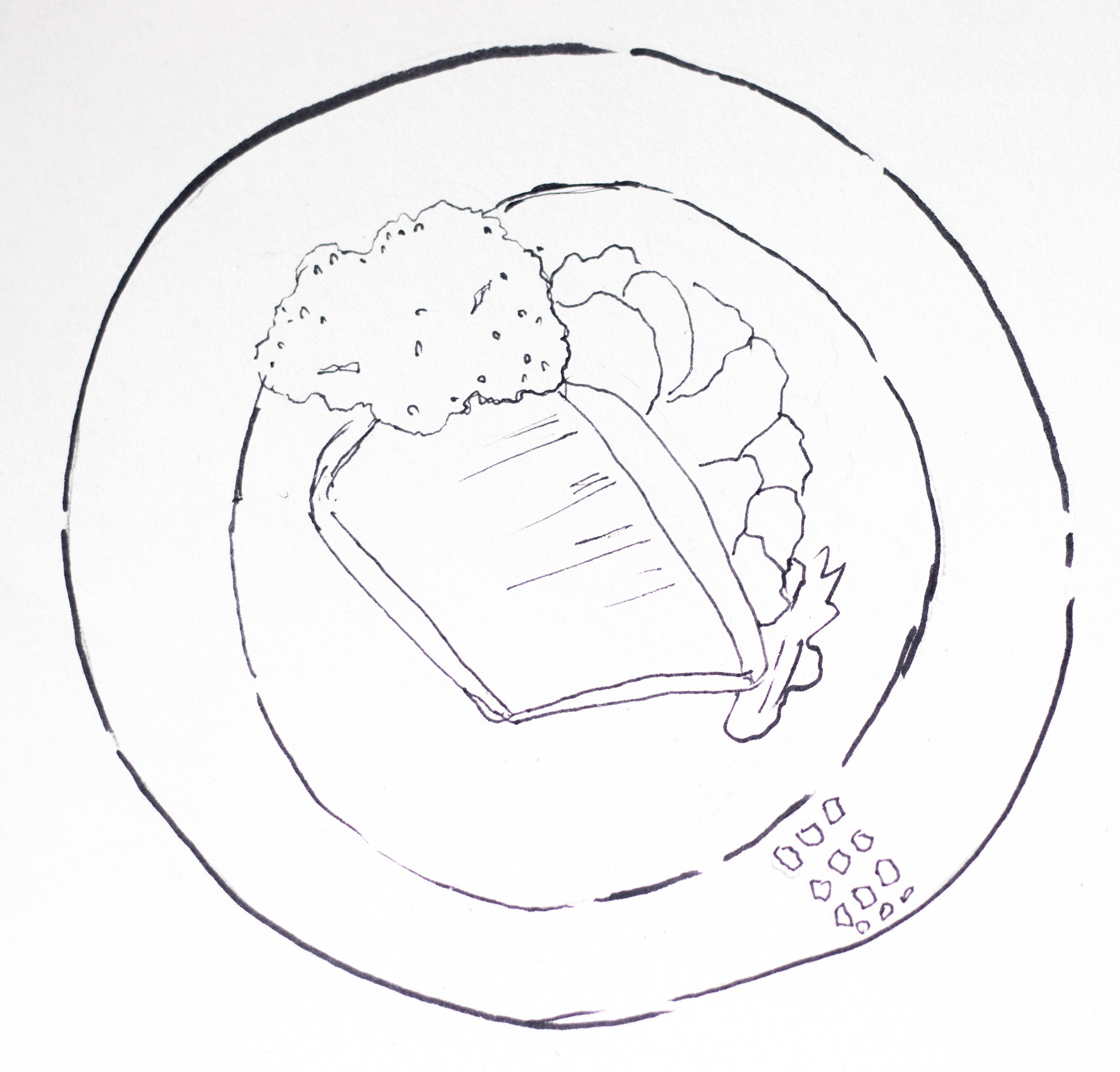
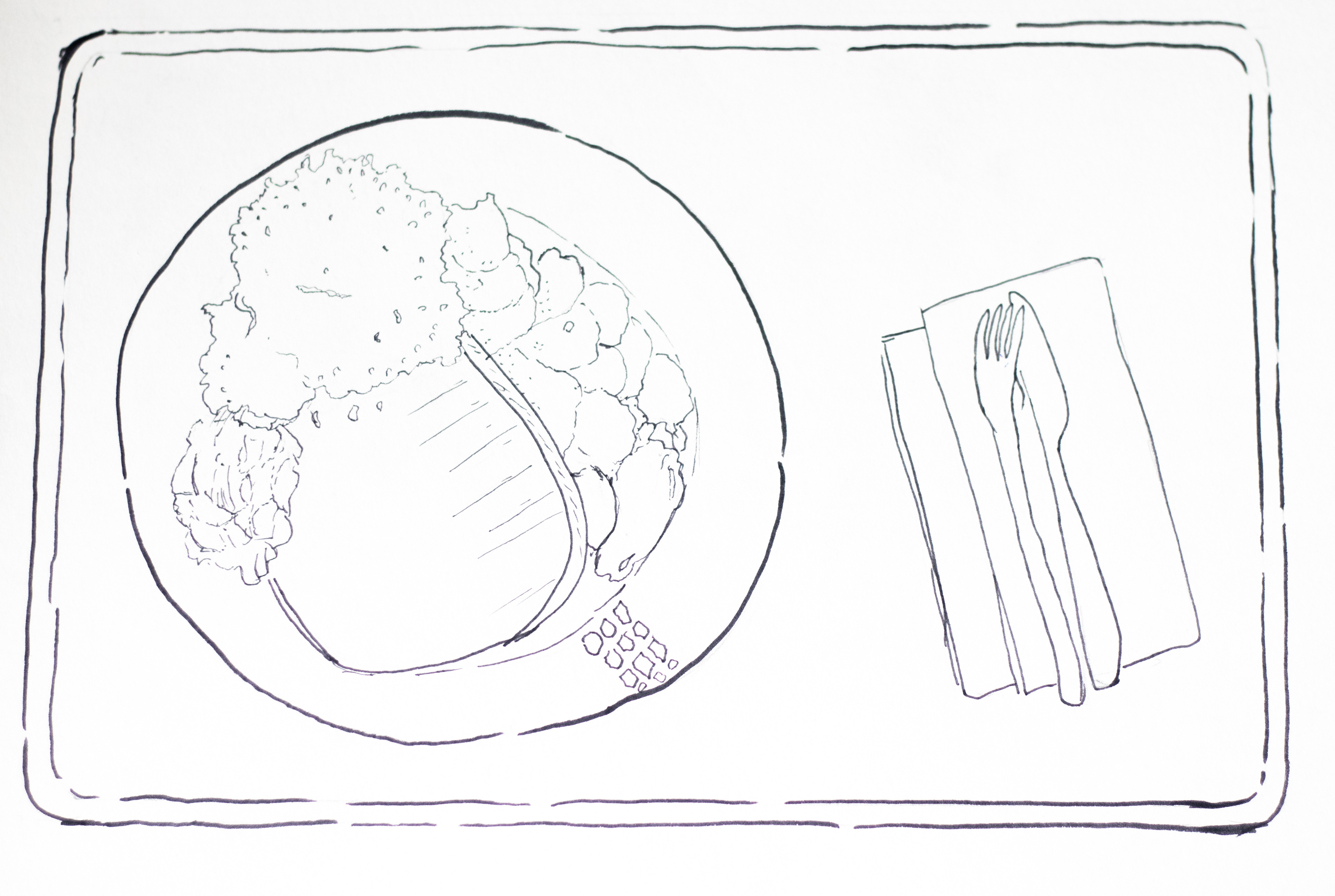
Hand drawn illustrations


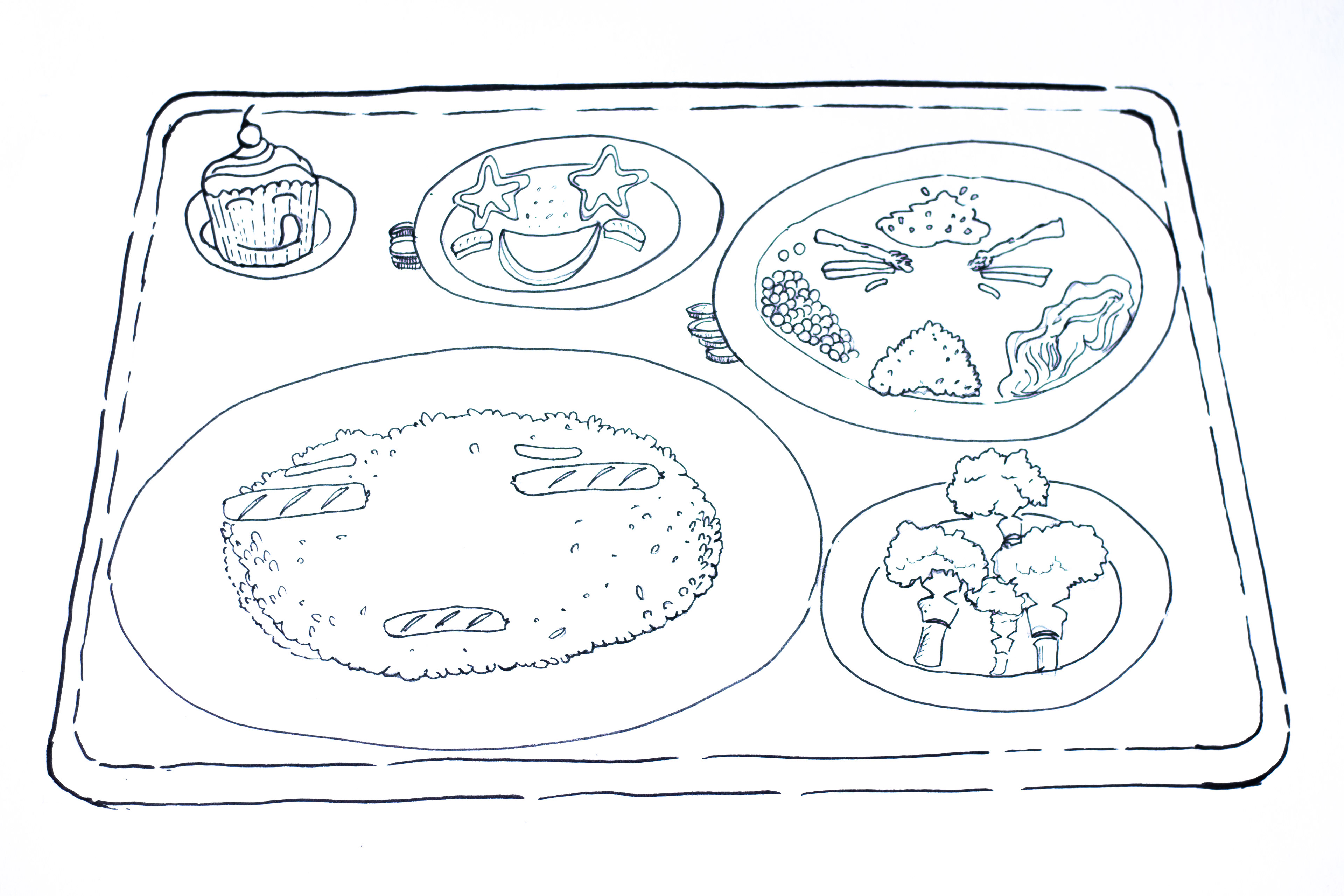
Final Poster